Websites are like the front doors to businesses and ideas. They’re the first thing people see when they step into the online realm. In this blog, we’re going to talk about something crucial: website design tips.
Web Design Tips
Why Does Website Design Matter?
Imagine walking into a shop in London. If it’s well-organised, clean, and has products laid out sensibly, you’re more likely to stay and explore, right? Well, that’s precisely what good website design services do in the online world. It makes visitors feel welcome, helps them find what they’re looking for, and keeps them engaged. And, as you might guess, when visitors stay and engage, it’s good for business.
Now, London is a bit like a digital jungle. It’s filled with all sorts of websites, from small startups to big corporations. To stand out in this competitive landscape, your website needs to be more than just pretty; it needs to be effective. That’s where great website design comes into play. It’s your secret weapon to navigate this jungle successfully.
In this blog, we will discuss the most useful tips for website design. So let us begin:
Website Design Tips
User-Centered Design
What’s User-Centred Design, Anyway?
User-centred design is a fancy way of saying that your website should be all about the people who use it. In our London shop analogy, it’s like designing the shop layout based on what customers find convenient, not just what looks good to the owner.
Know Your Audience
To make a website that people love to use, you need to understand your audience inside out. It’s a bit like knowing the neighbourhoods of London – each has its unique character and quirks. Knowing your audience helps you create a website that speaks their language, meets their needs, and makes them feel right at home.
Responsive Design for Mobile Users
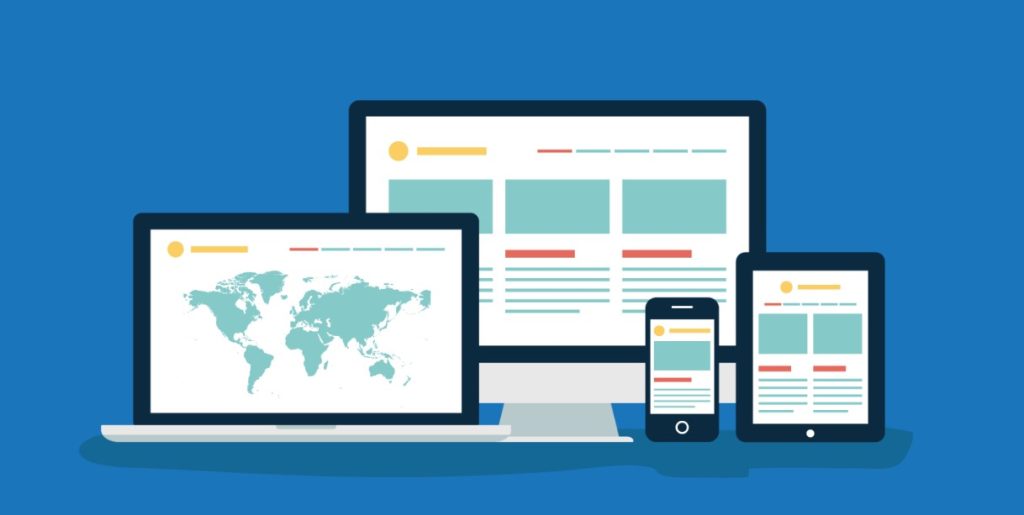
A website’s ability to adapt to different devices is like a London black cab’s versatility in navigating the city’s streets – it’s a must. Let’s dive into the world of responsive web design and understand why it’s so crucial.
Think about Londoners rushing about their day, checking websites on their smartphones and tablets. That’s the reality of the digital world. Mobile devices have become our constant companions, and websites need to be ready to welcome them. Mobile-responsive design ensures your site looks and works seamlessly on screens of all sizes.
Imagine you’re looking for a trendy restaurant in London, and you open a website that’s a mess on your phone. Frustrating, right? Google thinks so, too. Mobile-friendliness is a significant factor in SEO. Search engines prefer websites that provide a smooth experience on mobile devices. Plus, users are more likely to stay and explore if your site is mobile-friendly, boosting engagement and potentially increasing your chances of conversion.
Intuitive Navigation
Just as navigating London’s intricate streets requires clear signposts and a logical layout, your website’s navigation is crucial for user experience. Let’s explore why it’s so important and how to get it right.
Navigation is your website’s GPS. It helps users find what they’re looking for quickly and easily. If your navigation is confusing or unclear, it’s like sending someone on a labyrinthine journey through London without a map – frustrating and likely to result in them giving up.
Tips for Creating Clear and User-Friendly Navigation Menus:
- Simplicity is Key: Keep your navigation menus clean and straightforward. Use clear and concise labels that users can understand at a glance. Just as London street signs are easy to follow, your menu items should be self-explanatory.
- Logical Grouping: Imagine grouping London attractions by neighbourhood – it makes it easier for tourists to plan their visits. Similarly, organise your menu items logically. Group related pages or sections together to make navigation intuitive.
- Limit Dropdown Menus: While London’s underground system is extensive, your dropdown menus shouldn’t be. Avoid overwhelming users with too many submenus. Keep it concise and organised.
Think of your website’s information architecture as a well-organised London library. It’s about structuring your content in a way that makes sense. Plan your site’s hierarchy, ensuring that users can easily move from broad topics to specific details. A logical information architecture guides users on their journey through your website, making them more likely to find what they seek.
Incorporating responsive design and intuitive navigation into your website is like ensuring Londoners have a smooth commute – it keeps things moving and visitors happy. A mobile-responsive site and user-friendly navigation are essential elements in providing an exceptional online experience for your audience.
Visual Hierarchy and Typography
In the digital world, just as in London’s vibrant streets, there’s a need for order and clarity. Let’s delve into the principles of visual hierarchy in web design and the art of typography.
Imagine a London skyline at night – the tallest buildings stand out and draw your attention. Similarly, visual hierarchy in web design helps guide users’ eyes to the most important elements. It’s about arranging content in a way that communicates what’s most crucial, ensuring that users don’t get lost in the digital city.
Typography is to web design what accents are to Londoners – it gives character and personality. Fonts aren’t just letters; they convey emotions and establish your brand’s identity. Choose fonts that resonate with your brand’s values and message.
Colour and Branding
Colours are the palette of your website, setting the mood and tone, much like the vibrant hues of London’s diverse neighbourhoods. Let’s explore the psychology of colours and how they can reflect your brand’s identity.
Colours evoke emotions and associations. Red may symbolise passion and energy, while blue exudes trust and professionalism. Understanding these associations helps you communicate your brand’s message effectively.
Your website’s colour scheme is like your brand’s signature. Consistency in colour usage reinforces brand identity. Imagine if London’s iconic red buses suddenly turned green – it would confuse and disorient commuters.
Speed and Performance
Just as Londoners appreciate prompt public transport, website visitors expect quick loading times. Let’s highlight the connection between design elements and page load times.
Every design element, from images to videos, affects a website’s load time. Slow-loading websites frustrate users, potentially causing them to abandon their digital journey.
Page speed is like the smoothness of a London taxi ride. It impacts user experience and SEO rankings. Search engines favor fast-loading sites because they provide a better user experience.
Balancing design elements with performance is like orchestrating a seamless symphony in the digital world. A well-structured visual hierarchy, thoughtful typography, a harmonious colour scheme, and optimised performance create a user-friendly digital landscape akin to navigating London with ease.
Multimedia Integration
The way London’s diverse culture celebrates various forms of art, web design embraces multimedia elements to engage audiences. Let’s explore the role of multimedia in web design and how to use it effectively.
Think of multimedia elements (images, videos, and graphics) as the vibrant street performances in London – they captivate attention and tell stories. In web design, they enhance user experience and convey information in engaging ways.
Tips for Optimising and Using Multimedia Effectively:
- Image Optimisation: Compress and optimise images to strike a balance between visual quality and loading speed. Londoners appreciate efficiency, and web users are no different.
- Video Content: Videos can be like dynamic conversations. Use them to explain complex concepts or showcase products. Ensure videos are properly compressed and responsive for various devices.
- Graphics and Infographics: Just as London maps help tourists navigate, graphics and infographics simplify complex data. Use them to convey information clearly and concisely.
London is a city of diversity, and its residents appreciate a rich tapestry of experiences. Similarly, multimedia elements diversify your website’s content, making it more appealing to a broad audience. Engaging visuals can capture the essence of your brand or message, making it resonate with Londoners and global visitors alike.
Accessibility and Inclusivity
Inclusive design is like ensuring that everyone can enjoy the beauty of London’s landmarks. Let’s emphasise the importance of accessible web design and how it benefits all users.
Web accessibility ensures that your website is usable by individuals of all abilities. Your website should be accessible to everyone.
Similar to following regulations for building designs in London, web designers should adhere to accessibility guidelines. Compliance with standards like WCAG (Web Content Accessibility Guidelines) ensures your website is inclusive.
SEO-Friendly Design

Your website needs to be visible to search engines. Let’s explore the connection between web design and SEO and how to make your site search engine-friendly.
SEO (Search Engine Optimisation) is like placing your business on a prominent London street – it attracts more visitors. Good web design supports SEO efforts by providing a structure that search engines can easily navigate.
Tips for SEO-Friendly Design:
- Optimising Images: Use descriptive filenames and alt text for images. It’s like providing clear labels on London landmarks.
- Content Optimisation: Ensure your content is well-structured with headers and relevant keywords. Think of it as creating an engaging tour itinerary for visitors.
- Clean Code: Just as London’s streets are well-maintained, ensure your website’s code is clean and efficient. Bloated code can slow down loading times, affecting SEO.
- Mobile-Friendliness: Londoners love their mobile apps, and so do website visitors. Ensure your site is mobile-responsive for better SEO rankings.
Web design isn’t just about aesthetics; it’s about creating a digital experience that mirrors the inclusivity and efficiency of London’s diverse streets. By embracing multimedia, prioritising accessibility, and optimising for SEO, your website can become a digital landmark, attracting and serving a global audience.
Testing and Optimisation
We know London’s iconic landmarks undergo maintenance to remain spectacular; websites require continuous testing and improvement too. Let’s explore the significance of this ongoing process.
Web design isn’t a one-time effort; it’s an evolving journey. Regular testing and optimisation are like the city’s constant renewal. They ensure your website stays current, user-friendly, and competitive.
- A/B Testing: Similar to Londoners trying out different routes, A/B testing involves comparing two versions of a web page to determine which performs better. It helps you make data-driven decisions.
- User Testing: Invite real users to navigate your website and provide feedback. It’s like having locals test new London attractions – their insights are invaluable.
- Feedback Collection: Encourage visitors to share their experiences and suggestions. Just as London values its residents’ input, your audience’s feedback can drive improvements.
Suggestions for Ongoing Website Optimisation:
- Regular Content Updates: Keep your content fresh and relevant, much like London’s ever-changing cultural scene.
- Performance Monitoring: Continuously monitor your website’s performance, including load times and user engagement.
- Security Checks: Ensure your website is secure by regularly updating software and plugins.
Conclusion
Effective website design is your key to success, much like a well-planned route through London. Let’s recap the key website design tips discussed in this blog.
Key Website Design Tips:
- Prioritise user-centered design to meet the needs of your audience.
- Embrace mobile-responsive design for a wider reach.
- Create clear and intuitive navigation menus.
- Utilise a harmonious colour scheme that reflects your brand.
- Optimise multimedia elements for engagement.
- Ensure web accessibility for inclusivity.
- Implement SEO-friendly design for better visibility.
- Continuously test, optimise, and seek feedback for ongoing improvement.
- Investing in Effective Website Design
Your website deserves attention and investment. A well-designed website enhances user experience, builds trust, and drives success.